Kartography
(Mapping Folding@home)
Back in 2008, the Folding@home project released a world map showing where its donors are found around the globe (as seen below). These sorts of visualization, where populations are represented as variable-sized bubbles, are appropriately named bubble maps, and they can yield a ton of geographic information in a relatively simple layout.
 |
At the time, the map was made by manually entering IP addresses into Geostats and then projecting the latitudes and longitudes for each point onto a generic world map. When I learned about that, while coming up with ideas for a new blog post, I thought the whole process could use a bit of an overhaul.
 |
In this tutorial, I’ll go over how to create a visually striking interactive bubble map using just a list of unique IP addresses. We’ll be using Python to process the IP addresses and generate an SVG map of the world, and Javascript to generate the bubble map and add interactivity.
Dependencies
To work with IP addresses in Python, we’ll need pandas, python-geoip and geopy. We’ll also need kartograph.py to work with the SVG map.
Installing the first two packages is as easy as:
$ pip install python-geoip geopy pandasInstalling kartograph.py is a little more involved, but on Mac OSX can be done as follows:
$ brew install postgresql
$ brew install gdal
$ pip install -r https://raw.github.com/kartograph/kartograph.py/master/requirements.txt
$ pip install https://github.com/kartograph/kartograph.py/zipball/master
Processing the Data
I’ll assume that you happen to have a bunch of IP addresses just lying around to be processed. For this post, my data comes from the Folding@home points database. Each day hundreds of thousands of people around the world graciously donate their idle computer time to us, in order to perform simulations of biological molecules. This distributed computing generates tons and tons of research data with which we can use to study disease and perhaps even develop novel therapeutics. At the moment, I’m running a simulation of p53, a protein associated with more than 50% of all cancers; and since over 100,000 donors have worked on it (as of last week), I thought it’d be cool to see where my protein has traveled.
 |
First, we can start a Python session and import the following packages:
import json
import pandas as pd
from geoip import geolite2
from geopy.geocoders import Nominatim
Let’s define a simple function that retrieves latitude and longitude coordinates from an IP address:
def getCoord(ip):
    return geolite2.lookup(ip).location
Now we can loop over our file containing our list of IPs and convert them into coordinates:
coords = []
with open('myips.list','rb') as file:
    for ip in file.readlines():
        coords.append(getCoord(ip.strip()))
To find the unique coordinates and their counts, we can use pandas:
s = pd.Series(coords)
ucounts = s.value_counts()
Next, let’s write a function that takes those unique coordinates and finds a corresponding physical address. The tricky bit here is that these addresses do not have a standard format, making it somewhat difficult to parse. In the code below, I’ve tried to look for any reference to ‘city’, ‘town’, ‘county’, or ‘state’ (in that order). As a last resort, I’ll take the last field before the country name is referenced. I also included a catch-except statement in case the lookup fails:
def getCity(coord):
    try:
        place = geolocator.reverse(coord, timeout=10)
        address = place.raw['address']
        if 'city' in address.keys():
            city = address['city']
        elif 'town' in address.keys():
            city = address['town']
        elif 'county' in address.keys():
            city = address['county']
        elif 'state' in address.keys():
            city = address['state']
        else:
            city = place.raw['display_name'].split(',')[-2]
    except:
        city = 'unknown'
    return city
With this function, we have all the pieces needed to create a JSON-formatted database of unique coordinates with city/state names and numbers of hits from that location. We loop over the unique coordinates and build the JSON list as we go along:
info = []
for coord, count in zip(ucounts.keys(), ucounts.get_values()):
    city = ''
    if coord:
        city = getCity(coord)
        info.append({'city_name': city,
                     'lat': coord[0],
                     'long': coord[1],
                     'nb_visits': count})

json.dump(info, open('data.json', 'wb'))
This might take some time to run (my dataset took about an hour), but once it finishes you’ll have created data.json, which contains all of the information we care about for our bubble map.
Generating the SVG Map
So now that we have our data properly formatted for kartograph, we can get started on the more artistic portion of this post: map design. kartograph.py requires some map template files which can be downloaded using wget in the terminal, like so:
$ wget http://www.naturalearthdata.com/http//www.naturalearthdata.com/download/50m/cultural/ne_50m_admin_0_countries.zip
$ unzip ne_50m_admin_0_countries.zip
If you’re like me and didn’t have wget installed on mac, luckily homebrew has got your back:
$ brew install wgetIn the same directory, fire up Python again and type the following:
from kartograph import Kartograph
K = Kartograph()

config = {
          'layers':
            { 'land':
                {'src': 'ne_50m_admin_0_countries.shp'},
              'ocean':
                {'special': 'sea'}
            },
          'proj':
            {'id': 'mercator', 'lon0': 0, 'lat0': 0},
          'bounds':
            {'mode': 'bbox','data': [-205,-70,205,80]}
         }

K.generate(config, outfile='world.svg')
The key parts of the code from above are the 'layers', 'proj', and 'bounds' sections. 'layers' comprises the different objects included in your map; in this case, I’ve included the 'land' (as per our template) and the 'ocean'. 'proj' contains the details of your map projection. There are many kinds of map projections, each with their own pros and cons. I decided to keep it simple and chose a Mercator projection (which is what most modern maps show), but feel free to mess around with the different options and see what works for you. Lastly, are the 'bounds', which set the region of the map that you’re focusing in on. The format goes [minLon, minLat, maxLon, maxLat], so you can see in my example that I’ve overcompensated for distortion in the longitude and cropped the latitude to make the Mercator projection of the globe look better.
The last line in the code above will generate the SVG file that contains your map and should look something like this:
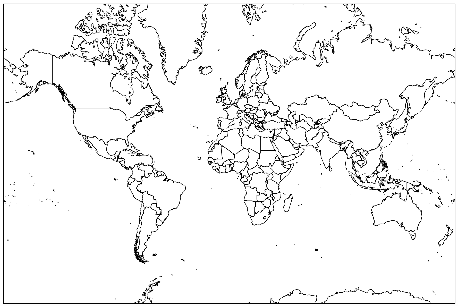 |
Putting it all together
All that needs to be done now is a little copying and pasting from the kartograph.js showcase page. We’ll be basing our bubble map on their noverlap symbol map. The basic idea is that the location data will be clustered into larger regions of overlapping density, yielding a much cleaner looking map. You can get a really good sense of this from their example.
This code will be a mix of HTML, CSS, and JavaScript, so go ahead and open up a text editor and copy this into it:
<head>
  <link rel="stylesheet" href="https://cdn.rawgit.com/kartograph/kartograph.org/master/css/jquery.qtip.css">
  <link rel="stylesheet" href="https://cdn.rawgit.com/kartograph/kartograph.org/master/css/k.css">
  <script src="https://cdn.rawgit.com/kartograph/kartograph.org/master/js/kartograph.js"></script>
  <script src="https://cdn.rawgit.com/kartograph/kartograph.org/master/js/raphael.min.js"></script>
  <script src="https://cdn.rawgit.com/kartograph/kartograph.org/master/js/jquery-1.10.2.min.js"></script>
</head>

<style>
.land {
	fill: #EDC9AF;
 	stroke: gray;
}
.ocean {
	fill: lightblue;
  	opacity: 0.2;
}
.my-map label {
    text-align: center;
    font-style: italic;
}
.my-map div {
    border: 1px solid #bbb;
    margin-bottom: 1em;
}
</style>

<script type="text/javascript">

$(function() {
    // initialize tooltips
    $.fn.qtip.defaults.style.classes = 'ui-tooltip-bootstrap';
    $.fn.qtip.defaults.style.def = false;
    $.getJSON('data.json', function(cities) {
        function map(cont, clustering) {
            var map = kartograph.map(cont);
            map.loadMap('world.svg', function() {
                map.addLayer('land', {});
                map.addLayer('ocean', {});
                var scale = kartograph.scale.sqrt(cities.concat([{ nb_visits: 0 }]), 'nb_visits').range([2, 20]);
                map.addSymbols({
                    type: kartograph.Bubble,
                    data: cities,
                    clustering: clustering,
                    clusteringOpts: {
                        tolerance: 0.01,
                        maxRatio: 0.9
                    },
                    aggregate: function(cities) {
                        var nc = { nb_visits: 0, city_names: [] };
                        $.each(cities, function(i, c) {
                            nc.nb_visits += c.nb_visits;
                            nc.city_names = nc.city_names.concat(c.city_names ? c.city_names : [c.city_name]);
                        });
                        nc.city_name = nc.city_names[0] + ' and ' + (nc.city_names.length-1) + ' others';
                        return nc;
                    },
                    location: function(city) {
                        return [city.long, city.lat];
                    },
                    radius: function(city) {
                        return scale(city.nb_visits);
                    },
                    tooltip: function(city) {
                        msg = '<p>'+city.city_name+'</p>'+city.nb_visits+' hit';
                        if (city.nb_visits > 1) {
                          return msg + 's';
                        }
                        return msg;
                    },
                    sortBy: 'radius desc',
                    style: 'fill:#800; stroke: #fff; fill-opacity: 0.5;',
                });
            }, { padding: -75 });
        }
        map('#map', 'noverlap');
    });
});

</script>

<div class="my-map">
    <div id="map"></div>
</div>
You can modify the <style> section to suit your aesthetics, as well as trying out the different clustering methods (none, kmeans, and noverlap) for the bubble map. Once you’re happy, the code can then be saved into an .html file and viewed in a web browser to produce something like this:
This map shows the all the places where my protein has been simulated using Folding@home over the past 3 months. Some highlights include the Northwest Arctic, Mecca, and Tasmania. The map is by no means perfect (there’s a town west of Melbourne named ‘5000’?!), but it gets the job done and is super easy to deploy for future data sets by just switching out the data.json file. Compared to 2008, though, I’d say the results are not too shabby.
 |